Thursday, February 22, 2007

Sunday lottery not so friendly after all

Today we had an interesting exercise to see how accessible some web pages where to everyone, the main reason for this was to test if it was user friendly for people with disabilities (for instance - some one who was blind) Yeah... I didn't know that until now but it is possible for someone who is blind to surf the internet, but as I found out it can prove quite difficult with most web pages because of all the 'bell's and whistles' that come with todays web pages (for instance flash applications and button) lets take a look at this page quickly


At first glance this web page looks pretty normal... well it is really. A pretty normal layout, normal colours, easy navigation. But what happens if you have a disability that prevents you from using a mouse and you can only use a keyboard effectively, well you are pretty much screwed with this page as they definitely didn't think of this one beforehand.

For example: I tried to navigate this with the keyboard and found I had to press the tab key 16 times just to get to this page. I then couldn't even see what I was highlighting most of the time, I finally managed to get on the flash window to start choosing my number. then more hell started, it was more difficult than I thought to choose a number - when I pressed up on the keyboard the selection square would either 'decide' to go upper left or upper right - I had no control over this. it was exactly the same if I pressed any of the other arrows, all in all it was bloody frustrating.

We then had a look at trying to make the text bigger on the page for people who had problems reading small text and also tried to change the background colour for people who had difficulty seeing black text on white, as you can see the text started overlapping and there was no change to the background colour whatsoever, also there where so many flash applications in this page that the majority of it didn't even change at all. Not very good at all. We also took a look at a program called Lnxy that changed pages into brail for people who couldn't see but it had so many links and other crap it would be almost impossible to access, even when you selected an option on the page it would redisplay the whole thing again... madness! Afterwards we had a look at what this page would have looked like to a colour blind person or to people who couldnt see very well. For the colour blind people it would have been damn near impossible to read the numbers on the balls, for the people who needed more contrast I believe they could have seen it easier if they just turned the contrast up on their monitor and got a decent pair of glasses, also there is a magnifying tool that comes with windows so there is another solution.

Heres are the answers for the sections (anyone reading this blog probably wont understand them so just ignore it, it's for the lecturers)


2.1 Monday, charities lottery
2.2 yes
2.3 yes, text that embeds flash features

Step 3

1. no it is not obvious you have changed the page
2.1 no its difficult
2.2 Pi553s me off, it's difficult.

Step 4

1. I could not see the selection box very easily and it took me 7 clicks to get to the 'play lottery feature'

2.1 no, its random
2.2 no, the flash controls are not very use-able
2.3 again pi55es me off!

Step 5

1 Not really, you could always up the contrast on-screen.

Step 6

1.1 some text changed but not by much... all the flash text did not change.
1.2 Flash text is fixed an seen as a picture not as text. also there is not much space left for text to expand.

1.3 Yes I expected the flash sections to remain the same. it is however not the desired result the user would want.
1.4 Flash sections
1.5 yes definitely for colour blind and hard of seeing people.

Step 7

1.1 poor - some sections could not be accessed
1.2 unusable - you could not use this page without plug ins
1.3 poor - extremely difficult to navigate using just the keyboard
1.4 poor - usable but not very nice for the user who has colour blindness
1.5 Ok - Most things could be seen by changing the contrast on screen or using a simple magnifying tool (however it is difficult to navigate when the screen is magnified)
1.6 it did not change much at all because of all the flash related features, trying to change the text colours did not work very well either.

Tuesday, February 13, 2007


Identities project - work so far


I have been working quite a lot lately on
our Identities project and will show you what I have achieved so far.

I started by acquiring the E4 logo from the internet, a pretty easy task at first until I tried to experiment with it in Flash MX - it was a sharp Jpeg image at first but when I tried to 'Trace' it automatically so I would have points I could manipulate it turned
my once smooth image into a bunch of jagged lines... yes it still resembled the E4 logo but was not 'clean' enough to be used. But never fear Illustrator CS2 is here, all I had to do was fire the baby up, stick the Jpeg in and with the handy Pen tool manually trace the image (which took roughly 7 minutes) - I smiled at my new vector image which could be zoomed in infinitely without loss of quality- there was a few lines that needed to be touched up but it was still a workable model to experiment with but I intend to make it flawless for my future use. So first I set about experimenting with animation (the reason I chose the E4 sting project in the first place) I later found out that I could have acquired a vector image version of the E4 logo from their website. I am also planning on changing the colour as it is more pink than purple (I would like to thanks my tutorial group for pointing this out) I will keep the pink version if I do a valentine theme though.

Animating using Adobe Premier

I chose Adobe Premier to Animate my first piece of work in because I believed I would have more effects and smoother movements than I could get out of Flash (which was my initial intent) I could also import higher quality sounds which would not be compressed as much when compiled to the final version, also I had the option of editing all the components if I wished on the university computers before I wrote it to DV tape. I started by creating all the simple components I would use in Illustrator CS2 first and exported them in PNG format (So I could keep transparent backgrounds) I then put all the components into the Premier Bin and started to slap them on.I found that Premier was flexible but required a hell of a lot more layers and skill to use than I would of had to do in flash as would probably only need three layers in flash but with premier I needed a layer for almost each component ( I probably could of narrowed that down if I made the field a single component which consisted of three individual components) I came up with this


If this movie does not play click here
I Would like to thank Adrian Snodgrass for helping me fix the size problems I was having with the window of the player.

Needless to say it was a successful test and I learned quite a lot about the capabilities of Adobe Premier, it was definitely not designed for animation but could still prove useful in the future.

I am also currently working on a sketch/Flash MX animation - I have found a link that has an example similar to what I'm going to accomplish - The story is crap in my opinion (not very good surrealism at al - the word I would use would be 'Lame') but the technique is pretty good.

Here's the link

Fun with Magazine's

It was now time for me to move on to other matters, Designing a T.V guide. I instantly decided that Illustrator was the best choice to do this as it offered previews of font styles on the fly, it would also be easier to position and manipulate elements on-screen. I started by knocking on the doors of all my flatmate's and humbly asking if they had a T.V guide, eventually I acquired one (The daily telegraph - Television and Radio) and started to browse over it. The structure was simple and easy to recreate - the main problem I came across was finding a suitable font style, I came across 'Courier New' and decided it was the most suitable, however I did have to change the Tracking, leading and horizontal scale of the text . here are the two pages I produced.


I learned quite a lot about stacking large quantities of text and images into small spaces and still keeping the page looking good at the same time, I do however think that I need to further design these pieces of work and possible add more pictures, also the 'Monday's Highlights' definitely needs to be converted back to flat text instead of the 3D filter I used as it looks out of place. I have also learned to place text and images with the correct text-to-image positioning on a page, I gained most of this knowledge by reading

Gordon, B. & Gordon ,M. Revised addition 2005 .The complete guide to Digital Graphics Design,London : Thames and Hudson LTD

Postcards

I Chose to design three postcards for my identities project to get to know more about branding, text-style, image positioning and effect,slogans and colour usage on a page. I have seen some good posters and flyers that attracted my attention and wanted to create something of my own - there where three books in particular that helped me create an accurate example.

Gordon, B. & Gordon ,M. Revised addition 2005 .The complete guide to Difital Graphics Design,London : Thames and Hudson LTD
Letterhead and Logo design (top design studio, Los Angeles). 2003, Massachusetts, untied states of America : Rockport publishers,Inc
Forrester, M., 1987. Everything you always suspected was true about advertising – but were too legal, decent and honest to ask, Glasgow: William Collins Sons & Co. Ltd

The Top two books helped me with the design side of things and the book on the bottom of the list helped create the slogan itself.
I started by looking at designers of posters that I liked, I found that the ones with a more simplistic design grabbed my attention more than other complex pieces of work, here are three examples I looked at and liked.


The afterhours package (from Letterhead & logo design) grabbed my attention the most - Simple and to the point - it said to me 'Here's our logo and here's some details if you want to find out more' it was very cunning because it grabbed your attention (with it's bright orange colour) it was easy on the eyes at the same time and was simplistic enough to remember clearly, An excellent design.

I wanted to create something similar but also with my own slogan, I looked up different types of layouts and text/image positioning in the book 'The complete guide to digital graphics design' and started to experiment. I came up with some awful designs to start off with but the more I played around with the design the more it evolved - even my original slogan 'Magic in the air' 'seeing is beliveing' became a more forceful yet refined 'There's magic in the air''Can you see it?' I decided to use the font Myraid that was hollowed out with a black and white gradient to make it look well... more magic. I also replaced two of the E's with the E from the centre of the E4 logo. the reason I positioned most of the text so close (and all bundled up) near the E4 logo was to get peoples attention to that area - also I wanted to link E4, 'The air' and 'Can you see it?'. I believe it worked quite well, I also chose to modify the E4 logo slighly by shifting the border to make it look more 3D (my intent was to make it seem more modern but I have no problems with the original whatsoever)

I think I am on the right track now and have gained some good experience, I hope to stick to my time-plan and accomplish what I have set out to do. I still wish I had never said that I was going to do a web page though but it will be invaluable experience I'm sure.

Monday, January 29, 2007

Peoples shows

Today we went to see other people productions, it was a very interesting experience indeed. I personally went to see the 'show' titled "The life of Dame Laura Knight", unfortunately I did not have the pleasure to see others as I had a very important matter to attend to. What did I think of this play, well I will try analyze it as the lecturers would. Brutal honest truth which will not win me any friends, but it is important information to know for the future.

The advertising for this event was very well done for the time limit, the card displaying the location, time of the even and price was well constructed and to the point - I was also impressed the way the team sent the information to the VLP email addresses of all the people on our course. The location was well chosen and was relevant to Dame Laura Knight, the seating area was a bit cramped but acceptable. The charge was 50p to watch the 'show' which at first I thought was acceptable but was not handled in a professionals manner, also I did not receive a ticket which was a disappointment as I would have liked something to hold and remind me of the event.
The show itself was not very impressive, I did not feel as though the team had practiced beforehand as everything was read out from a piece of paper and where almost definitely just copied and pasted from a website of encyclopedia, there was no eye contact. I did not feel any passion in the words that where being read out which made the performance uninteresting. The team did however wear appropriate outfits but the times when people where supposed to come on did not seem properly queued and the actions of the characters again showed not much interest. However I understand the people involved are not drama students so I guess the performance was satisfactory. I still don't know who Dame Laura Knight accept that she was an artist, so henceforth I believe the information was not presented correctly and that the 'key' points where not highlighted. My advice for future productions would be to take the information and write a script from bullet points from the information attained from research, maybe spice it up by not reading from a piece of paper and presenting the information with more confidence.

I apologize for such a harsh review, at least the team did there's though which is more than I can say for myself, good job.

Thursday, January 25, 2007

Harold Shipman Project

Ouch... Well this one did not turn out as planned, unfortunately we where not prepared enough to deal with this situation and ended up pulling out.

All was going well at first, We identified various peoples strengths and took advantage of that, we formulated a plan and story quite quickly out of such a sensitive subject. Rimante and myself wrote the script and did the theme, Gav was also quite useful in this area when we initially discussed what issues we where going to address and how and constantly tried to keep in touch with the rest of the group.

All went well up to this point - unfortunately we did not acquire our intended location (Old age home), this was due to the fact we where having problems getting through to the 'head' and arranging something, we had a backup plan to do it at a local hospital but that didn't surface either.
It was quite unfortunate because we had all our actors too who boldly volunteered for this task - Rob would play the role of the psychiatrist, Kamal would be the street-wise cop , I would play the role of the presenter , Rimante and Ben would play the role as the bodyguards and Gav was going to take care of the technical side of the show. Ben would also provide pictures for the slide-show.

I am quite sad it did not take place but there was not much chance it was going to happen. Again I blame it on the lack of communication. but I do think it was a better idea to pull out instead of trying to make a half-decent show that was not rehearsed properly or correctly set up.

I will however be looking forward to going and seeing other peoples shows, I am quite interested in seeing 'The life of Dame Laura Knight' - I am impressed with the advertising of this show, I mean why not use the VLP email system to get to everyone, its fast easy and effective... and its something we would all like to know about - very good job guys for seeing and using this system, you got a paying customer right here.
Group Movies

We went to watch the entire multimedia Narratives movies on a big screen!!! It was excellent to see our productions in all their glory with stereo sound, unfortunately there where some hitches an one group did not have this luxury.
I really enjoyed watching everyone else's movies, I am not critic but some I liked and some I didn't but it was still very interesting non the less.

The most memorable one (apart from the name that is) was the one where everything turned into a comic book, it was a good story and the technique was well thought out and displayed. I also think our production 'Mr Pickles and the lost coin' was a great success and had quite advanced techniques compared to others I viewed, also our story was easy to understand and comical - we received laughs from the audience at the intended points in the movie henceforth proving that our planning was accurate and most importantly 'Worked' it was very useful to get feedback from the audience in this way.

Thursday, January 18, 2007

Blast from the past

My good friend Andrew Tomlins recently posted one of our old projects we did at College on Utube, it was fantastic to see after such a long time... I thought it was lost forever. he is also posting the DVD addition to me (apparently it 1.6 gig). Anyways enjoy.

Credits go to - Todd Gledhill - Directing & script
Andrew Tomlins - Editing & camera work
Ian Sanders - Acting
Katie Notley - Assistant director


Monday, December 11, 2006

Analyzing that narrative thingy that we did .

I am going to apologize beforehand for the God awful title you are about to see, yep it was a requirement so don't blast me if you don't like it - here we go, let us begin.

Highlight the skills and knowledge you have gained and developed and show how you have gained them. Provide suggestions for improvement and how these attributes will inform your study in future modules this year.

What’s going on?

I have broken down the project into key sections for easier reading, hopefully this will also make it more interesting.

The idea

I was very interested when I found out our project would have to be a short Narrative story, almost instantly I was thinking up ideas for a short but sweet story. I remembered that most good short stories are found in comic books… like Garfield or the Beano and Dandy comics. I remembered an episode in the Dandy where Desperate Dan is walking along the docks; flicking his ‘lucky Dollar coin’ basically a shark comes along, jumps out of the water and eats it. Dan being a tough guy jumps into a row boat and goes after this enormous shark (about three times bigger than ‘Jaws’), His cousin thinks him to be lost when his boat is salvaged, bitten in half. However at the end he returns riding the shark with his lucky dollar (which turns out it wasn’t his lucky Dollar really as he had left that at home) and ends up spending it in a snack machine. I basically took my inspiration from this piece and came up with something different.

The technique

Initially one would think straight away that the best way to do a story would be to book out a video camera and shoot it. I however have had experience in this process and didn’t think it would be appropriate for our first project. I discussed this with my team members. Firstly we would have to carry lots of equipment, the weather would have to be taken into account, so would our window of opportunity every day when the lighting of the sun would be round about the same luminosity (it was going darker, earlier lately so it would be slightly unpredictable but not impossible of course to time). For our story too there would be many locations involved and what would be impossible would be to get those locations with no people in them as it could conflict with our story… well if we had an air raid horn we may have been able to trick a large amount of people to duck for cover, quickly take the shot and then end up in jail for disturbing the peace but I don’t think it would have been worth it in the long run.

I thought it would be wiser to choose a process that we could tailor to suit our every need, but also something that was not too difficult to achieve.

A light switch went on in my head, wouldn’t it be nice to do a picture story as we would be able to control most aspects relatively easy and make any changes in Photoshop. I looked into this and found that something about photography was working well, but something wasn’t. It was basically looking like someone’s holiday snaps and the locations did not give off the appropriate ‘feel’ I would have liked; after all, this story was meant to be wacky in a way and should at least have something odd about it.

I thought that maybe I should try do something to the images, in fact why not use the backgrounds and drawn the characters. I jumped on to the internet to do some research.

Dive-dead copyright 1998 C’s WARE

After sifting through what seemed like an eternity of ‘crap’ I came across something very interesting called Divi-dead; This was Japanese game that featured manga characters appearing on hand drawn background, both looked excellent and worked well. It flowed pretty damn well too and I decided that we must do something similar to this. Taking into account of course time and budget, and the fact that no one in our team had ever drawn manga (excluding myself but I was nowhere near even being called an amateur) and could not create such amazing backgrounds and characters in the time we had.

A bit of playing around with techniques would be necessary, so I fired up good old Photoshop and had a play around; I separated the character from the backgrounds and stuck them in various scenes… some quick drawn scenes in ‘paint’ – they looked awful and where deleted instantly. Some normal photographs – they just looked like obvious cut-outs. Then I tried them on a background of a stage I built a while back; this stage was just a test map for a game called ‘Half life 2’ and I had fortunately taken a screenshot to show a friend at one point. I experimented with this and found that the photo fitted in very well with the backgrounds, also it was obvious that the sets would be easy to control and would never be crowded with people, also the lighting could be controlled and so could the weather!

I also found that it added a certain ‘oddness’ to the whole thing but looked pretty damn good at the same time, It was clear that it would be a perfect technique to use and we could also use certain other Photoshop techniques to enhance the cut out photos (I.e. shadows and reflections of characters on the tailored world)

I researched a great deal for this program and learned a great deal about lighting techniques and prop placement. The two main sites I used where à

http://www.migandi.org.uk/tutorials/half-life2-editing-hammer-tutorials.htm - SDK advanced/basic techniques

http://developer.valvesoftware.com/w/index.php?title=Hammer_Editor_Documentation – Hammer guide web page

I also found Wikipedia to be very helpful.

I popped an example on the VLP forum just give a good idea of what the general technique would look like.

I proposed this technique to my fellow team mates and it was agreed.

The team

The team consisted of the following people:

-Morag Upton ß Jesus reincarnated in female form

-Domonic Saneria

-Aaron Sinfield

-Andrew Twyman

-Ian Sanders ß Me

Fortunately we had a member in our team, who almost immediately assumed the role of producer, Morag was essential to the success of this project as she planned out all of the schedules and broke them down into small chunks that everyone could easily do in the time set, in the end it did not go as smoothly as planned though, due to lack of communication on the VLP forum – I learned that if ever I work in a team again it is essential that the team ALWAYS keep in touch some way or another and keep progress of each others work as we had a small gap when we where supposed to be doing work and didn’t communicate and almost nothing got done!

The extra work load that built up had to fall somewhere and it landed on my head, which was frustrating to say the least, however I learned quite a lot from the experience as I did sections that I wouldn’t have to have done and a lot from section that I had to do more of than I initially expected.

Morag and myself wrote the script – I got hold of a second year’s (Multimedia) script example and examined the technique the script was put together, I learned a great deal about structure and how important it was to ‘feel’ the characters, it was Titled ‘Clown’ but did not specify the author. I wrote a small treatment first before we actually got down to the script ß I probably should have mentioned that first. Morag saved my butt on many an occasion and also did a large chunk of the workload.

Dominic was in charge of the sound and got hold of quite a few fitting ones, I helped with the music.

Aaron was in charge of the storyboarding and some of the Photoshoping which involved modifying characters; the VLP message boards were very useful again, we could see some of Aaron’s sketches and plan our characters before hand. The work produced was of high quality but the essential storyboards were not done in time and caused great problems as we needed the angles for photography and for taking screenshots in the world editor used to create the sets. Fortunately Morag created a written storyboard that was invaluable (saving the day yet again)

Andrew did some research for lighting and camera functions took most of the photos and also generally helped with the ending title screen during editing and converting sounds into appropriate formats.

I learned quite a few important team leading and organising skills from Morag in particular who kept the project afloat, Morag was in charge of costume props and keeping the project organised (also at the initial editing phase), she too did a fantastic job on the text slides and inserted them during editing.

What I learned

I learned quite a few interesting techniques used to create a narrative story. I have broken them down into sections.

Storytelling -Taking a simple idea and turning it into a vibrant story, character relations and using the correct environment to make a viable tale. I would have liked to have written a slightly longer story though, but do to time limits that would not have been possible… however it was interesting to have constraints and turned out very well. I also learned that creating a story from the basis of an already successful story was quite a smart thing to do.

Pictures and scenes – I learned that lighting is everything when it comes to producing a successful clip; I believe that our lighting was not all it could have been due to the lack of research on 3 point lighting and the camera – resulting in a darker hue colour range, I have come to this conclusion by comparing our production the ‘The life of a post-it note’ done by another group, their lighting was a lot more vivid and crisp due to correct white balancing and lighting.

The scenes made in the ‘hammer editor’ where works of art, the lighting was spot on because the program took care of all that including shadows, however if you look carefully in some scenes you will see that the character was not placed exactly at the right angle (the train station for example), the storyboards would have been helpful during that stage of creating the narrative. But other than that I believe they lacked nothing.

Music & Sound – Unfortunately this was one of the sections that suffered the most due to late work, I am not entirely satisfied with the selections of sound (even though in the hundreds). I do believe we got the best ones associated with actions but the ambient ones where pretty poor and did not fit in properly and lacking in other places (well so I think anyways). I would have liked to have given this section more attention if it would have been possible.

The music was very fitting, I thought game music on game backgrounds was very clever and it did indeed fit. I believe all of them where appropriately timed too.

The music was found here - http://www.vgmusic.com/

Editing – The editing was not very hard at all and did not even require research even though I had only played with Adobe Premiere in a previous lesson.

The only problems we ran into was how outdated the software was on the machines we where using, we constantly ran into problems – for instance some of our music was in a midi file format and had to be converted to mp3 before it would work and we could only do this through Itunes on the Macintoshes. The Photoshop on these machines was some sort of ‘limited addition’ and didn’t even have layer effects!

This caused hassles when trying to make minor changes to our pictures. I have learned that we should probably stick with the Macintoshes when editing next time as I have used them in the past and they are relatively reliable when **not** plugged into a network.

Teamwork – It is very important to constantly be in touch with members and stick to the deadlines set or the workload falls on other team-mates and to keep track of the progress of each team member contribution every couple of days. The experience was interesting but also very frustrating… I have learned that the only person you can rely on is yourself, oh and Morag of course… But if you must work in a team then I have learned you have to keep in constant contact, no room for negotiation on this point.

Friday, December 08, 2006

Space centre trip

The space centre trip was a blast (no pun intended), we got to see all sorts of interesting facts about space and all sorts of different ways of displaying them. It was quite interesting to see they where trying to teach people by putting everything in the most interactive forms they could, mostly by making little games with the information they where trying to get across. I thought it was a pretty smart idea indeed as a person will definitely remember a game they have played instead of some interesting information displayed on a boring board. I noticed that their target audience was aimed more to children than adults, however it was still fun to tinker around with the entertainment provided.

We watched a pretty good movie on a dome screen, I was expecting a Imax theater (with 3D glasses) but was disappointed... however it was still a decent enough show and very informative at the same time.
I personally enjoyed the flight simulator - well, it was more like a screen with moving chairs, this was however 3D and quite entertaining.

I have learned quite a lot from my trip to the space centre, I have picked up valuable knowledge on designing displays and also got a good understanding of how you can explain complex things by breaking them down into small chunks and then making them as memorable as possible by adding character& set design and a narrative story.

Sunday, November 26, 2006

- Got an idea -

I have come up with an idea that I would like to try out, unfortunately I do not have access to the proper blue screening facilities to try it out as they will have to be bigger than the ones currently available to myself in the university studios. If anyone has a good idea about this little delema please post a comment, it will be a big help and I will give you credit if I get to make one.

During this past weekend I have had alot of work to do relating to our project called 'Narratives' We are creating a story using scenes made with a program called 'Hammer world editor'... using props and textures for the game 'Half life 2'. We are then sticking in photos and additional props that have been created in 'Alias Maya' and finally editied in 'Adobe Photoshop' - You can see a example of what I am talking about below this post.

What I want to try out is using real life acted characters put onto game backgrounds!
I would like to thank Paul for showing me a excellent machinima site that gave me a good insight of what a real life acted movie would have to have to be to put together properly. It can be found here
Oh yeah, I created a musuem on Friday, these are the kind of scenes I am thinking of using (this one is from the Narrative we are working on now)


Anyways I think it's a good idea...

Thursday, November 23, 2006

Sort of like Machinima

well our Narrative project is coming along smoothly, we have had a few hitches here and there but all seems to going to schedule.
We are using Photos pasted on backgrounds made in a game 'map builder' called Hammer, we are using the Half life 2 textures and props (like trees for example) to bring the stages to life.
Heres a quick sneak peek of what to expect.


What a fantastic program, it not only lets you control the lighting, shadows and sky but even adds reflections to water and textures like metal and glass. We are further modifying these pictures by inserting photos using Adobe Photoshop and adding any other reflections or shadows that might be required.
I have high hopes for this project, now all we have to do is put it together in a linear story... add some music/sound effects and hey presto - we have a winner.

Thursday, November 16, 2006

Reply to YouTube clip.


We recently had to respond to a YouTube video with a video of our own, I think the reasons where more for the technical knowledge ganied than the actual movie itself. One of my Collueges and myself decided to do a joint project. I did the camera work and loaded the footage onto the computer, he did the acting and full editing including transistions. This went quite efficiently with only a few minor,initial setbacks which where quickly resolved.


The 30 second clip can be found here
as well as my collueges blog which is here

Wednesday, November 08, 2006

YouTube Comment

Well... we had to make a YouTube account and comment on one of the vidoes we found interesting. I decided to comment on an episode of South Park, titled ' Make love not warcraft' found at the following location.

http://www.youtube.com/watch?v=za5k8ZPc490

This is what I said

Hahaha Excellent, Gotta love the creators of South Park to keep it original by actually teaming up with Blizzard to create this masterpiece. 10/10 - Thumbs up :)

Indeed, the creators of South park teamed up with the Blizzard team that actually made the game and created a episode that has won 20 honours on YouTube so far. Its an excellent example of what people can do when a group of people with different specialities team together to create something.

10/10 Thumbs up :)

Tuesday, November 07, 2006

Fantastic Narratives


Dragon Nuts
uploaded to Dailymotion.com by slantdtv


Well here is a series I just found a few weeks back, Love at first fright!

I would like to use this as an example of some of the ultimate narrative ideas to be created using such an easy and reusable technique.
For a start all the props can be found at your local toystore or those dusty boxes that you have packed away from your childhood - oh yes and some plastercine.

I was really surprised at the quality of the stories that one could get accross from such simple props, it's a definate inspiration to us all.
The thing that worked really well about these stores was the way they played on the fact that the character where from our childhood, Transformers and even the Thundercats. They take this odd combination of characters and completely change thier personalities (a little bit like what they did with the 'Scary movie' films) , reducing our once most treasured heroes to Zero's in some cases. I however found that it breathed new life into all the character - like if they grew up and changed whilst we have been away these past years, some even working dead end jobs just to support thier drug habit after thier stardome died.
The other thing I really liked where how small and well planned the short clips where that made up a series, none really followed the other in a logical fashion but still managed to work anyways.
The voices and lines are well thought out and hilarious.

I have no negative critisism at all for this series... so what, the characters look crap (no fancy, high end animation to be found here), the storylines are random but so what.

It just works so damn well.

I chose this specific one because of the parody about 'The never ending story'

Monday, October 23, 2006

Image meaning (analysis)


The computer must be the most functional possession I have in my arsenal, as for it’s decorative value… that can be debated.

By design it is meant for functionality; its architecture is cold and boxed in. This device is however a lot more entertaining than it looks; it is basically just a designated point where communication takes place in many different forms. Pictures, music, text, movies and even games all in an interactive environment, these can expand your knowledge of yourself or another user. What music a person enjoys would almost definitely be found on his/her computer and what games a person play are a source of what character this person has, we can also deduce more if we examine the computer itself - If the person cleans it or not tells if this person is organised or not; from these pieces of information we could form a clear understanding of the individuals ‘world’ or Personality.

As for environmental values of this object they are clean to run and also consume small amounts of electricity, however many parts become obsolete relatively quickly and are thrown away, thus adding to our landfills as they can not be safely disposed of in other ways - this is one of the negative effects.

As for showing our world past and future, just by looking at a computer can tell you exactly what you want to know about the era one is in. the older more un-stylised models would be designed less to be eye pleasing where as the more modern ones would be sleek and exiting. It can also tell you a lot about the future of this item if we look back at the past first, over just a short time this machine has made it into almost every home and have become essential in almost every business, and as for more knowledge about the past, this can be found on the internet.

The only future outcome possible is that these machines will be around for a very long time.

-------------------------------------------------------------------------------------------------

From what I could understand by the task and what it required...I hope I have analysed this picture correctly

Sunday, October 22, 2006

Some more surrealim I find interesting.

Heres another surrealit artists work that I like, Jan Svankmajer. this is his home page and some of his examples of his work can be found here. enjoy


Thursday, October 19, 2006

My review on some movies

Ah ok, let us take a look at some movies I have dug up, Ive had a good night out and still managed to squeeze this baby in.


Heres a sneaky one I dug up on Fat-pie.com

The movie title is Alen, this character was created on paper using ink, some felt tip pens and patience.
I really liked this story as it was surreal (I love surrealism), however for David firth this was quite a diffrent approach than most of his short clips as it had a logical begining and ending (but somehow still retained its surreal nature), this was due to the characters; they where human like but also alien.
The story line revolved around a Character called Alen who assumed the role of a hero, this hero could sense a gunshot victim before the devious act actually happened, it goes on to explain (right at the end) that he gets these visions 30 seconds before the initail crime - henceforth he does not have time to save anyone but continues to try anyways.
An impressive feat indeed as all the backgrounds and characters where hand drawn and then animated in a program I expect to be Imovie or Adobe premier (I have done a project in the past called 'Burslem life' using this technique and it does take time and patience using photos instead of hand drawing) A definate must see for those who would like to experiment with moving stills.

I dont want to sound like a Boffin or anything but I have done something simular before, the web site that this movie can be found at is Studentfilms.com - under the name (Ken's new specks), this narrative has a sort of abvious outcome, as soon as I started playing it I knew what would happen. this film seems to be animated in I-Stopmotion and is made of clay models mixed with material and other items, the backgrounds seem to be custom build too but are simply paper (I expect the work was done in Photoshop), the models are very well build and the scenes are well planned.
A very funny tale that is worth taking a look at.

Ah yes, definately one of my favourites

I found this beauty at atom films (search google) - it is called Animator vs animation.
It is a really clever film in my opinion as the clip actually takes place in the program used to create the animation (Flash). the stick man decides he does not want to be deleted by the user and fights back, this is an amazing flash animation and will make anyone laugh who has a sense of humour. very clever, very profesional and just basically a well produced flash animation that is fun to watch. the characters are basic but it portrays exactly what it is meant to, the creator must have had alot of fun with this one.


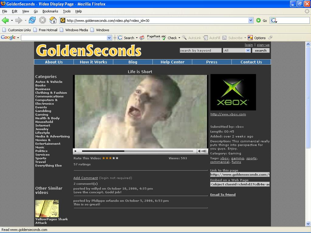
This movie is by far the most impressive I am writing about. I found this one at www.Goldenseconds.com - the title, Lifes too short.
It starts with a woman giving birth, she then SHOOTS her newborn child through the operating theaters window and he flies through the sky aging as he goes along only to smack into a grave at the end. Like my description of this short clip, its short and so is life. At the end we descover it is a Xbox advertisement... I cant explain the full effect, you have to watch it for yourself.
The move is created using video and some 3D backgrounds, very effective.

Tuesday, October 17, 2006

Surrealism

I've always liked Surrealism for some reason, some of the things are just so damn odd you cant help but like it.

This art form was origonally founded by the french poet Andre Breton from what I can gather, he published his first book Surreal Manifesto in 1942 - Paris. It basically is an art form that tries to represent ones unconcious thoughts.

I am personally impressed with one surreal artist known as Salvador Dali (1903 - 1989). I remember hearing that when he initially studied in a school of art he told the lecturers that they where not worthy to mark his work, Now thats what I call bold. I have to admit he was a genius.

The persistance of memory - by Salvador Dali


I am now impressed with the way that surrealism has made its way into the flash animation side of the internet. One person in particular that I think deserves credit is David Firth. His site is www.fat-pie.com

One of the characters that always makes me laugh is Salad fingers who is just one bizaar creature that you can not easily forget.