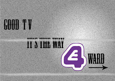
I have been working on my postcards lately as I needed a change from making my web site (which is going pretty well so far - I am using Adobe Illustrator CS to create the template) I have settled on one but still think it need something, fortunately I have saved it in the .AI file format so it will be easy to change. I tried to recreate the static effect on a T.V that had been unplugged (had no signal - more commonly referred to as snow and those annoying lines that come up when the signal is bad) using a number of filters at my disposal (The film grain filter was most crucial) I wrote the text 'Good T.V is the way forward' (something I hear students say a lot - henceforth my target audience) and the 'Snow' on the
 background to emphasis the E4 (the only coloured item) channel would not have this problem as it was clear and crisp (thanks vector images) The text was a sort of western style which would emphasis entertainment (it is the most recognizable and to me personally dull movies out there which backs up the background, thats why I chose this text) - I also put the E4 symbol in a spotlight which attracts the readers attention. Take a look.
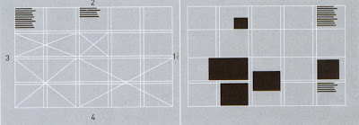
I ran through a few of these following some simple layout rules which I gained from a certain book.
-Letterhead and Logo design (top design studio, Los Angeles). 2003, Massachusetts, untied states of America : Rockport publishers,Inc.- <--- notice the Harvard reference. Here are the layout design I used - remeber to click on the images to get a better view.

 If you would like to comment on this design please do, just remember there is a limited time before the hand in date is quite soon so please comment soon. thanks a mil in advance.
I have done another one as some feedback stated that the positioning of the text could have been better. This is another style I took from the same examples I used to create the previous one. it still uses the same technique of guiding the eye downwards - like steps. but has a lot more harsher decent. it leaves the same amount of space open as the previous one did on the sides but at slightly less curved angles. I will be submitting both in my final folder.
