My first character
Here's my first beasty, I titled it 'Rant' hope you enjoy it :)
Saturday, December 15, 2007
Saturday, December 08, 2007
Creating a possible disappointment:
I have been working on my character which has to be presented on Wednesday, Of course as you would know if you have been reading my blog my character is a sort of devil thing. I hope I can get away with it this time as last time in school art class I drew a similar character I was instantly branded a satanist by the teacher (the joys of school in South Africa) - anyways, lets hope that doesn't happen again lol. I referenced the image I hand drew to create this character, I then wacked a few colours on him, gave him some awesome teeth and some funky eyebrows to help show expession
 all
all
 has gone pretty well until I started with morph target. Let me explain : To get the eyebrows and get the in I had to up the amount of vertexes. Later I had to create teeth and create a smoothing effect for them so they would'nt look blocky and this also applied to the eyebrow which was also a solid block. after that I decided 'right, time to animate this bugger... what was it Andy taught us again, AH!! yes of course, morph targets' It was easy to create eyebrow expressions and morph the eyelids but when it came to the mouth I found that I had made so many damned polygons that it took ages to change the mouth, the fact teeth where morphing and changing shape didn't help but fortunately 'Soft selection' saved the day. after creating loads of these morph targets and linking them all I found that I was unable to link the eyes I had set to express anger (it consisted of 2 parts and didn't morph correctly) also I noticed my system was starting to respond slowly when I attempted to do this (which is pretty strange as it has 4 gig of ram , a 1 gig graphics card and AMD Daul core 3.2ghz Black addition CPU - In short, this shouldn't happen... ever!)
  I found out that the reason was because I was trying to trick the eyeball and the eyelid (last 3 to right hand side) to morph to something that had a FFD4 modifier on which it did not like at all. If I wanted this affect I would have to do this manually. I continued to make more clones of the body and made many, many expressions.
I then started to rig the character using the sheets that I had obtained from Andy Loves lesson, I ran into no serious problems at all and when I did I just reflected back on the sheets. I will not explain the process of how I rigged the character, I will just display a screenshot of the final setup. (click on it for a better look)

It was now time to animate, but first to put in the sound - I had great problems with the sound because 3d max would not import a 8 bit mono track (Dungeon keeps voice file) so I had to rune it through Quebase, convert it to stereo before it would work... to make matters worse the sound would only start from the very beginning of the time line and would not move further along the timeline to start at a different point, this was (mind the expression) a pain in the ass to correct, I had to search many forums to find the answer (eventually found it here ) - it involved opening a window called the dop e sheet and then easily sliding the track along to the desired point.
All I really did then was add a box at the bottom of 'his' feet - added a bitmap material ( which was a screenshot of a stage I made for my first Identities project called 'Mr pickles and the lost coin'using Hammer editor for half life 2)to my materials library and dragged it onto the box.
After that I just animated the beast... Tip: before you start rendering always set your output file size to PAL (yes it's there). I then popped a few lights in to give me suttle shadows and then rendered it. to a AVI file... Which I hope will work :)
I have been working on my character which has to be presented on Wednesday, Of course as you would know if you have been reading my blog my character is a sort of devil thing. I hope I can get away with it this time as last time in school art class I drew a similar character I was instantly branded a satanist by the teacher (the joys of school in South Africa) - anyways, lets hope that doesn't happen again lol. I referenced the image I hand drew to create this character, I then wacked a few colours on him, gave him some awesome teeth and some funky eyebrows to help show expession

 all
all has gone pretty well until I started with morph target. Let me explain : To get the eyebrows and get the in I had to up the amount of vertexes. Later I had to create teeth and create a smoothing effect for them so they would'nt look blocky and this also applied to the eyebrow which was also a solid block. after that I decided 'right, time to animate this bugger... what was it Andy taught us again, AH!! yes of course, morph targets' It was easy to create eyebrow expressions and morph the eyelids but when it came to the mouth I found that I had made so many damned polygons that it took ages to change the mouth, the fact teeth where morphing and changing shape didn't help but fortunately 'Soft selection' saved the day. after creating loads of these morph targets and linking them all I found that I was unable to link the eyes I had set to express anger (it consisted of 2 parts and didn't morph correctly) also I noticed my system was starting to respond slowly when I attempted to do this (which is pretty strange as it has 4 gig of ram , a 1 gig graphics card and AMD Daul core 3.2ghz Black addition CPU - In short, this shouldn't happen... ever!)
  I found out that the reason was because I was trying to trick the eyeball and the eyelid (last 3 to right hand side) to morph to something that had a FFD4 modifier on which it did not like at all. If I wanted this affect I would have to do this manually. I continued to make more clones of the body and made many, many expressions.
I then started to rig the character using the sheets that I had obtained from Andy Loves lesson, I ran into no serious problems at all and when I did I just reflected back on the sheets. I will not explain the process of how I rigged the character, I will just display a screenshot of the final setup. (click on it for a better look)

It was now time to animate, but first to put in the sound - I had great problems with the sound because 3d max would not import a 8 bit mono track (Dungeon keeps voice file) so I had to rune it through Quebase, convert it to stereo before it would work... to make matters worse the sound would only start from the very beginning of the time line and would not move further along the timeline to start at a different point, this was (mind the expression) a pain in the ass to correct, I had to search many forums to find the answer (eventually found it here ) - it involved opening a window called the dop
 e sheet and then easily sliding the track along to the desired point.
All I really did then was add a box at the bottom of 'his' feet - added a bitmap material ( which was a screenshot of a stage I made for my first Identities project called 'Mr pickles and the lost coin'using Hammer editor for half life 2)to my materials library and dragged it onto the box.
After that I just animated the beast... Tip: before you start rendering always set your output file size to PAL (yes it's there). I then popped a few lights in to give me suttle shadows and then rendered it. to a AVI file... Which I hope will work :)
Friday, December 07, 2007
Lip Syncing
I have been experimenting with the lip syncing model Andy gave us and produced this short clip. I found it harder to achieve on my computer as my sound card was too quick and got each an every small sound (making it very confusing) instead of having a longer, more recognizable sound on the university computers which believe it or not made it a hell of a lot easier. I am quite happy with the fact that this is my first lip sync clip I have ever done... of course there is a few times when I could have made the lips move at certain times to produce a better illusion it was actually speaking but had so many key frames in at different points that it became quite confusing, this has taught me to try keep all the actions all at the same point on the time line instead of scattered randomly. Anyways here we go, hope you like the result
Thanks to Andy Love for the great and already rigged cats head
Monday, November 26, 2007
Art Gallery adventure
We set out to Waterstones to attend a display of 'Nancy Farmer's' work, after reaching the 4th story that is. I was not aware hoe much artists actually earn until I saw the price tags... approx £250 a pop and also sometimes up to £1.5k per painting. The amount of detail that went into this persons work was quite impressive - on first inspection I suspected it was water colours and later after looking on her website confirmed this (Well, thats about all I learned to do on the art course I took over the last holiday), This person uses a technique where she wets the paper, allows it to expand, then tapes it to an easle and waits for it to dry again... the reason? so when she paints on it again with water colours the paper wont 'puff' up as it normally would. before painting though everything is done in pencil (with some pretty damn impressive detail) - I liked Nancy's effort and dedication (as she has done a lot of these detailed paintings) but unfortunately the style and content was not my taste, don't get me wrong as there where very impressive paintings there but they didn't really make me feel anything - I guess the only pixies and mythical creatures I appreciate are the ones on computer games that I can go toe-to-toe with. Anyways, here is some of her work - I hope you enjoy it more than myself
Click here for her website - you may also be interested to know she is a member of 'The Guild of Erotic Artists'


Sunday, November 25, 2007
Video Editing lookup:
I have been looking around on the internet to try and find something that is professionally done but yet you can see how the shots are planned out and where the editing has been sneakily used (but not too sneakily or we wouldnt see it) - I uncovered this gem here
You can clearly see in the first few shots how editing has been used to create a specific effect - when he is getting ready the camera shots have been continued from specific 'Powerful' points (for instance, you dont see him walking to a table , getting his shoes, seperating them, undoing the straps, putting his foot in and then only strapping them on again... You just see him with his foot in, closing the strap with passion - Giggidy!)
On later scenes we see where scene props (Does a puff of steam count as a prop?) need editing to create the effect intended. The lighting was also very well done in this clip - it remained dark and eery (like all famous batman movies) yet you could clearly see what was going on.
I found a nice example of a lighting technique in 'Cracking animation - Peter lord & Brian Sibley' - here are a few photocopies.


Please feel free to click on the pictures to enlarge them and get a better view.
All is explained in the black and white pic.
I shall now wrap it up and say this look into editing has wanted me to play around with lighting more... and how fortunate am I that the animation lecture today was about creating lighting. lucky, lucky , lucky - I must definitely be a sign.
Saturday, November 17, 2007
Start of a character
 I have now started the development of my character for my 30 second animation due by Christmas. this started out by a quick doodle drawing I did. Just a basic concept of an idea that definately needed improving upon to even become slighly usable.
the character looked pretty evil (due to the fact he had serpent eyes) but needed to represent the human form more in terms of body. I decided I would like my character to be chubby (sort of like a little chubby dwarf like thingy) so I started to look for those types of forms

I then started to look for this form and found it in a book called 'How to paint and draw children' by Viola French - I chose this book as I was pretty sure that a Toddlers form was what I was looking for in terms of body proportions but to my surprise found that the 1 year old form was better (Much more chubby like the fat little drawf thingy I was trying to create) I put the two together an bam!!! here's what I got
 Of course this character did not look 'Stunning' but the chubbiness and body is just fine - of course the fingers, feet and legs need refining along with a whole overhaul of the face but the basic concept is there. I now had something to work with.
I was browsing on the internet and found a way to import your drawing into 3D max and work with them, I did a little test and the result can be seen below... pretty cool little tip. I will be using this process to create my character when I have enough time to do so, unfortunately I'm quite a busy little fellow as of lately so I expect to attempt this in a day or two.

Thursday, November 15, 2007
Walk Cycle
Here we have two example of the walk cycle I did from the exercise sheets provided by Andy Love, of course we had to do the movement ourselves but the rigging was all done to the specifications of the worksheet (and a well written one indeed) I hope to incorporate this with the hand rig and then the face morphs to finish my character I am in the process of creating.
Anyways, heres the first one.
And the Second view is from behind, wish I had tweaked his/her butt to look better (it's all about the sexy bums)
I also found a nice demo reel of character walk cycles and actions which you can view below
And another one with decent facial animations, I suspect these to have been done in Maya
Friday, November 02, 2007
Comments of 'Holding pattern' clips
This has been a very interesting exercise, this task was the commetns we had to make on (firstly) what the character did to illuminate his/her character? and what the 'film maker' did to illuminate his/her character?
Team - Lez, Sherry (sorry didnt catch the rest)
Actor
- Looks around a lot, always looks uncomfortable
-always wearing a suit, looks out of place.
-does not speak making him seem more out of place
-always looking in dictionary and various books for words
Film
- lots of cuts
- excellent use of camera angles
-Fantastic use of lighting in every scene
Team - Cat, Alex (sorry didnt catch the rest)
Actor
-looks slighly out of place
-Constantly sitting and observing
Team
-lots of far away shot making the character seem distant
(Most shots I found to be a little bit too long)
Team - Glyn, Holly and Dave
Actor
-wears good realistic clothing
-acts appropriately in all situation
- is a bit sneaky
Film
-Music rises and dips at appropriate times
(I found the sounds to be overpowering at most point)
Team - Adrian, Emily , Zaid and Richard
(My favourite one)
Actor
-Acts very out of place
-Really like the comedy
-Acting was very good
-Actor made the clothes work well and to his advantage
Film
-Good props
-Highlighted immigration (used newspaper to highlight this) 0- which gave a clear explanation of what was going on.
-Again, really like the comedy
-Football scene was really well done
-Like the little sub plot with the Family tree on the internet
-Music was very fitting
-Very good use of camera angles
---------------------------------------------------------------------------------------------
And there we have it. I would just like to congradulate Adrian, Emily, Zaid and Richard again for a very well done piece of work. I think it matched the professionality of of Lez's group (who has the benifit of Lez's years of experience) and I really enjoyed how you made the character out of place while using comedy.
Wednesday, October 24, 2007
3D Character:
This was a very good exercise and has been the only one that has really interested me so far this year in this course, in fact its the only one that has stopped me from transferring. The idea was to create a cartoony 'cat' or some other 'creature' using 3D Max. I found this to be a fun and useful exercise. Here is what I produced.
 -Not the greatest of characters but a good first experiment, More work would have been done on this character but there was not enough time to do so as we where given four other projects to do at the same time as this one, making finding time to complete improve on the project I actually enjoyed very difficult.
 The only problem I had was when I tried to turbosmooth the character, odd holes appeared at the side of it's ears and the face sort of went into itself. the face part did not make the character look particularly bad but it was technically wrong and would have played hell if I tried to develop the character further. I chose the shiny metal skin to check for errors on the background, it worked nicely.
 One feature I managed to refine was to give this 'creature' a mighty fun butt. Important stuff first I always say... I am looking forward to practicing making some more character on my own time when we have finished with all the other work we where given in one shot. I am finding this course to be slightly frustrating at the moment because of disorganization on my part and the university.
Sunday, October 14, 2007
Holding Pattern
We have been given a script and told to create a short 5 or so minute movie with it, the script is called 'Holding Pattern' and is basically a small snapshot of a foreign person (Romanian) life in Britain. I have checked YouTube for clips with the same name and came up with two that use the same script... however one of them uses a French person instead of a Romanian. here they are
This one is the French version of the same script, I did not find this one as interesting as the second version I found (can be found below this clip) - however I did like the little change to the script and the fact that this person was telling his story through a letter he was writing to his mom, very good improvisation.
Although this clip was not shot with greater detail to lighting (as the one above has) I felt the shots where really well done and gave a very good 'feel' to the movie, the music suited pretty well but the thing I would of incorporated from the last one was a way to 'steer' the story better (by writing the letter and telling the story better instead of just a few random shots without a narrative) - the thing that I was also impressed with about this movie was that I recognized most of the locations in these shots and thus giving me a pretty clear picture of how it would look if we used these locations and also showed me the types of props they used which could definitely be beneficial when picking ours ... thanks guys.
Friday, October 12, 2007
Thanks to Hannah Berry for emailing this list of 'The reason's why Joolzs gave us the exercise about taking an already written script and turning it into a quick clip' Also thanks to the whole group for contributing to this list.
- -So people can learn to analyse a text.
- -Look at other peoples’ work.
- -Learn to work as a team.
- -Make up own ideas to add to the script.
- -Try different things with the cameras.
- -Practice with different equipment.
- -Try to interpret other peoples’ work.
- -So we can experience following and writing a script.
- -Learn to deconstruct a script.
- -Learn what a script looks like.
- -Start to understand the process of scripting.
Thursday, October 11, 2007
Analyzing a short clip exercise
We have been asked to analyze a short clip and give our general impression of what the director or creators intended
So where to begin?
-The clip starts with a medium close up shot - the characters steps are heavy, reinforcing the fact that he not only looks big but is also one bulky fellow (by the way he walks you can also instantly asses the person in question is male) - the camera movement is quite unprofessional and goes in & out of focus from time to time throughout the movie as the character changes position. the character is seated and the camera angle + rooms which is quite and has florescent lighting gives the mood that this person is being interviewed. the distance does change once during the interview (when he is examining his gun) - the shot 'Medium shot' (and silence) makes the person watching seem as though they are examining the characters natural behaviors when alone (a bit like a wild life documentary).
The next shot is a close up of the characters face, this is used to show his expressions more clearly.
and finally coming towards the end we have a nice pan around the character, again zooming in closely to his face to show his ' clearly crazy' expression and then zooming out again to show the destruction he is causing with loud bangs and gun noises which reinforces how volatile the area is.
* This clip is taken from the promotional videos for a game called Team Fortress 2 - developed by Valve*
We have been asked to analyze a short clip and give our general impression of what the director or creators intended
So where to begin?
-The clip starts with a medium close up shot - the characters steps are heavy, reinforcing the fact that he not only looks big but is also one bulky fellow (by the way he walks you can also instantly asses the person in question is male) - the camera movement is quite unprofessional and goes in & out of focus from
 time to time throughout the movie as the character changes position. the character is seated and the camera angle + rooms which is quite and has florescent lighting gives the mood that this person is being interviewed. the distance does change once during the interview (when he is examining his gun) - the shot 'Medium shot' (and silence) makes the person watching seem as though they are examining the characters natural behaviors when alone (a bit like a wild life documentary).
The next shot is a close up of the characters face, this is used to show his expressions more clearly.
and finally coming towards the end we have a nice pan around the character, again zooming in closely to his face to show his ' clearly crazy' expression and then zooming out again to show the destruction he is causing with loud bangs and gun noises which reinforces how volatile the area is.
* This clip is taken from the promotional videos for a game called Team Fortress 2 - developed by Valve*
Monday, June 11, 2007
3D Max experiment
I Have been experimenting with 3D max lately and am coming along quite well I think, I have been trying my hand at modeling and doing slightly more complex animation animation techniques which at first where quite difficult to understand but later became quite logical. of course I have not mastered the skinning process and am only using basic omni lighting at the moment but with time I am sure that it will become second nature. here are two examples of my most recent work.

the first one I experimented with was a short exercise given to us in a recent lecture. I created this model again but did not look at the sheets (well actually once to get the height and width of the initial block that the exercise was started with) I was really surprised how easy and quick it was to model something in 3D max after only a few lessons. I also used custom omni lighting and a custom' skin' (chosen to look like plastic) henceforth inspiring the name 'Plastic man'
I had fun creating this character and hope to maybe bring it to life in the future by adding a few arm and leg movements... maybe even a face.
The second one I did was a more complex animation technique requiring a 'rig' on the character (some controller handles) to make moving the character less confusing... well it did indeed make the character easier to animate but the initial rigging was a pain at first but after a quick visit to Andy Love it was make clear what I was doing wrong and was corrected promptly. I decided to add a few features on the initial object (which looked like a leg with a giant ball on top) so I added a nose, mouth, two eyes, a pair of ears and some spiky hair with an antenna like one in the center. it turned out O.K and was easy to animate - however there was still some distortion on the bottom of the foot when it came back to its landing position but that can be rectified in the future. I am starting to like this program more and more and am quite sad to hear that we may be converting to Maya next year, however the experience gained here will not be in vain and I may even like Maya more.
Tuesday, May 01, 2007
Squidy!!!!!
I have been playing around with 3D max on my computer and thought it would be a good idea to try do the squid exercise again. Fortunately I had the exercise sheets at hand to make sure I didn't run into any major problems along the way but attempted the exercise without looking at it too much- it was a great success. I rendered it out to 101 jpeg files (320X240), imported them into Imageready and funnily enough exported it as a flash file (I attempted this first in flash but could not do it. Here is the final result, enjoy.
I have been playing around with 3D max on my computer and thought it would be a good idea to try do the squid exercise again. Fortunately I had the exercise sheets at hand to make sure I didn't run into any major problems along the way but attempted the exercise without looking at it too much- it was a great success. I rendered it out to 101 jpeg files (320X240), imported them into Imageready and funnily enough exported it as a flash file (I attempted this first in flash but could not do it. Here is the final result, enjoy.
Layout for Presentation
Introduction.
• Present self (“hello my name is…”)
• Reminder of project done (Ie E4 Stings)
• Initial idea
• Present what work and points will be covered.
-Postcards
-Magazine
-E4 Stings
-Website
(For each one of these sections comment on the following)
• Research
• Programs (Problems and solutions)
• Time management (was it well planned out?)
• Did it work (give evidence by comparing to other peoples work or through evidence found out via surveys)
• What have you learned?
Conclusion – Was it successful overall? Back up with examples from above.
Sunday, April 29, 2007
Another post card is created
I have been working on my postcards lately as I needed a change from making my web site (which is going pretty well so far - I am using Adobe Illustrator CS to create the template) I have settled on one but still think it need something, fortunately I have saved it in the .AI file format so it will be easy to change. I tried to recreate the static effect on a T.V that had been unplugged (had no signal - more commonly referred to as snow and those annoying lines that come up when the signal is bad) using a number of filters at my disposal (The film grain filter was most crucial) I wrote the text 'Good T.V is the way forward' (something I hear students say a lot - henceforth my target audience) and the 'Snow' on the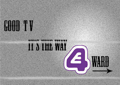 background to emphasis the E4 (the only coloured item) channel would not have this problem as it was clear and crisp (thanks vector images) The text was a sort of western style which would emphasis entertainment (it is the most recognizable and to me personally dull movies out there which backs up the background, thats why I chose this text) - I also put the E4 symbol in a spotlight which attracts the readers attention. Take a look.
I ran through a few of these following some simple layout rules which I gained from a certain book.
-Letterhead and Logo design (top design studio, Los Angeles). 2003, Massachusetts, untied states of America : Rockport publishers,Inc.- <--- notice the Harvard reference. Here are the layout design I used - remeber to click on the images to get a better view.
 If you would like to comment on this design please do, just remember there is a limited time before the hand in date is quite soon so please comment soon. thanks a mil in advance.

I have done another one as some feedback stated that the positioning of the text could have been better. This is another style I took from the same examples I used to create the previous one. it still uses the same technique of guiding the eye downwards - like steps. but has a lot more harsher decent. it leaves the same amount of space open as the previous one did on the sides but at slightly less curved angles. I will be submitting both in my final folder.
I have been working on my postcards lately as I needed a change from making my web site (which is going pretty well so far - I am using Adobe Illustrator CS to create the template) I have settled on one but still think it need something, fortunately I have saved it in the .AI file format so it will be easy to change. I tried to recreate the static effect on a T.V that had been unplugged (had no signal - more commonly referred to as snow and those annoying lines that come up when the signal is bad) using a number of filters at my disposal (The film grain filter was most crucial) I wrote the text 'Good T.V is the way forward' (something I hear students say a lot - henceforth my target audience) and the 'Snow' on the
 background to emphasis the E4 (the only coloured item) channel would not have this problem as it was clear and crisp (thanks vector images) The text was a sort of western style which would emphasis entertainment (it is the most recognizable and to me personally dull movies out there which backs up the background, thats why I chose this text) - I also put the E4 symbol in a spotlight which attracts the readers attention. Take a look.
I ran through a few of these following some simple layout rules which I gained from a certain book.
-Letterhead and Logo design (top design studio, Los Angeles). 2003, Massachusetts, untied states of America : Rockport publishers,Inc.- <--- notice the Harvard reference. Here are the layout design I used - remeber to click on the images to get a better view.

 If you would like to comment on this design please do, just remember there is a limited time before the hand in date is quite soon so please comment soon. thanks a mil in advance.
I have done another one as some feedback stated that the positioning of the text could have been better. This is another style I took from the same examples I used to create the previous one. it still uses the same technique of guiding the eye downwards - like steps. but has a lot more harsher decent. it leaves the same amount of space open as the previous one did on the sides but at slightly less curved angles. I will be submitting both in my final folder.
Evaluating own work
I have also dug up the link for those that wish to 'Harvard reference' -
Most of the time when writing a report (especially for lecturers) it is important to note that they will not be too interested in the programs and process you created the final product with, they will be more interested in why you chose to use those programs, why you used certain methods to create the product and most importantly what influences and materials inspired you to create the final piece of work – just saying you created a post card and the reason you decided it was finished was ‘because it looked good’ will not be looked upon too favourably.
I have also dug up the link for those that wish to 'Harvard reference' -
Friday, April 27, 2007
3D Max text animation test
Here we have a quick text animation test I did in 3D max, unfortunately I did not attend the first 3D animation lecture because I was confused by the ever changing timetable (In fact I was looking at three different ones!)Fortunately one of my colleges gave me a copy of the notes that where used in the lecture (Thank you Sid) and I created this animation from following the instructions. I attempted to create shadows on a Solid object directly below the text but it was not successful - I will attempt this again in the future. I probably would have been able to figure it out with the use of the 3D max help files but my computer was playing up and did not allow me to access this resource... I guess I will be taking out the book in the library soon.
Here it is.
Monday, April 23, 2007
Heartless Henry E4 Sting
Well I've completed my E4 Sting called Heartless Henry and have finally decided to put it up on my blog.
I have already mentioned how I animated my character in articles below so I shall not repeat the process, What I will mention here is how I created the background. Firstly, what better way to start than with a short movie clip - enjoy kiddies.
I Wanted to created a background that the Heartless Henry character could believably exist in, I knew I was going to have to stick to the colour scheme I initially started with (Gray scale - pencil drawing) as my character would look out of place in a nice, Millions of colours, Fully textured background. I also created the character with the intent to be standing in a 3D background as his feet positioning will give away - It also had to be surreal as my character was too. I built the set above using Google sketchup and tried to make it look habitable yet and extremely strange place to want to live, Initially I was just going to leave it as blank walls with shadows and maybe a few Photoshop effects but then I came across some very nice sketch textures which fitted perfectly. I then decided it would be a worthy idea to try different techniques in Photoshop anyways and see if I could create a different ambience, I was truly considering adding fog but it didnt work in the end, here are a few examples of angles and filters I tried - apart from the last one titled White block.JPG which was used to create the fade out effect in my final production. - PLEASE CLICK ON THE IMAGE TO MAKE IT BIGGER AND GET A BETTER VIEW.
After playing around with the character on these backgrounds I came to the conclusion that I would not have to add any effect to the background as it suited quite nicely (less can be more sometimes)
I then put the character into Adobe After effects (or should I say put the background behind my completed character) and BAM! it worked very well. The problem I had next was that Adobe After effects did not have the ability to do real time sound editing so I would have to make a sound, put it in and then render the whole damn thing as an AVI file before I could see it. This was unacceptable as sound editing required exact timing and even 0.2 of a second can make one hell of a big difference. I came up with a quick solution for this... Render the animation with the background to a PAL/AV format and then import it into Adobe Premier - I then proceeded to add the sounds in there and it worked fine. The only problem I ran into again was when I tried to 'Export' the new file using the DIVX compressor (It was reccomended by the Youtube Website to obtain best results on their systems ) I got lots of 'Artifacts' -> (which are blobs, irregularities and distortion on the clip) . I suspect it was due to the fact that my animation was rendered at 30 FPS and I was compressing it at 25 FPS again. I didnt bother trying to prove this theory and just exported it as a PAL File again with no compression as it turned out to be a relatively decent sized file anyways.
Here it is (not in it's full glory as the Youtube compressor Screwed the quality up just a little and made it more blurry but it is still acceptable) - I will try to upload it to www.Motiono.com at a later date though, this site offers better quality and faster uploads, another thing is it does not feature as much spam as Youtube either in my humble opinion.
And there you have it, Heartless Henry is born.
Well I've completed my E4 Sting called Heartless Henry and have finally decided to put it up on my blog.
I have already mentioned how I animated my character in articles below so I shall not repeat the process, What I will mention here is how I created the background. Firstly, what better way to start than with a short movie clip - enjoy kiddies.
I Wanted to created a background that the Heartless Henry character could believably exist in, I knew I was going to have to stick to the colour scheme I initially started with (Gray scale - pencil drawing) as my character would look out of place in a nice, Millions of colours, Fully textured background. I also created the character with the intent to be standing in a 3D background as his feet positioning will give away - It also had to be surreal as my character was too. I built the set above using Google sketchup and tried to make it look habitable yet and extremely strange place to want to live, Initially I was just going to leave it as blank walls with shadows and maybe a few Photoshop effects but then I came across some very nice sketch textures which fitted perfectly. I then decided it would be a worthy idea to try different techniques in Photoshop anyways and see if I
 could create a different ambience, I was truly considering adding fog but it didnt work in the end, here are a few examples of angles and filters I tried - apart from the last one titled White block.JPG which was used to create the fade out effect in my final production. - PLEASE CLICK ON THE IMAGE TO MAKE IT BIGGER AND GET A BETTER VIEW.
After playing around with the character on these backgrounds I came to the conclusion that I would not have to add any effect to the background as it suited quite nicely (less can be more sometimes)
I then put the character into Adobe After effects (or should I say put the background behind my completed character) and BAM! it worked very well. The problem I had next was that Adobe After effects did not have the ability to do real time sound editing so I would have to make a sound, put it in and then render the whole damn thing as an AVI file before I could see it. This was unacceptable as sound editing required exact timing and even 0.2 of a second can make one hell of a big difference. I came up with a quick solution for this... Render the animation with the background to a PAL/AV format and then import it into Adobe Premier - I then proceeded to add the sounds in there and it worked fine. The only problem I ran into again was when I tried to 'Export' the new file using the DIVX compressor (It was reccomended by the Youtube Website to obtain best results on their systems ) I got lots of 'Artifacts' -> (which are blobs, irregularities and distortion on the clip) . I suspect it was due to the fact that my animation was rendered at 30 FPS and I was compressing it at 25 FPS again. I didnt bother trying to prove this theory and just exported it as a PAL File again with no compression as it turned out to be a relatively decent sized file anyways.
Here it is (not in it's full glory as the Youtube compressor Screwed the quality up just a little and made it more blurry but it is still acceptable) - I will try to upload it to www.Motiono.com at a later date though, this site offers better quality and faster uploads, another thing is it does not feature as much spam as Youtube either in my humble opinion.
And there you have it, Heartless Henry is born.
Photoshopping photo's
I was just looking around Youtube and found something quite interesting, it was a short movie clip about retouching photo's in Photoshop. I'll just pop it here for people to have a look at. One thing I like alot about this one was how he ( Rodrigo) adjusted the eyes to make them stand out more, it makes such a big difference. I think the Kid at the end of the clip looks a bit creepy afterwards though as the picture is darkened more and the colours made more bland, Still a nice technique though and the music compliments it well.
Here's another one I dug up too, it shows everything in more detail but can be quite lengthy to watch and only shows the techniques briefly but it's still quite impressive, this one shows how the Pro's do it - lots of messing around but the result is excellent - Makes you want to grab one of those horribly taken photos of yourself out of the drawer and do some magic. Gotta love Photoshop.
Subscribe to:
Comments (Atom)
